Mom mentioned to me how she felt the online photos of the 80’s house for sale didn’t really look like the rooms do in “real life.” Primarily, her complaint centered around photos of the family room.
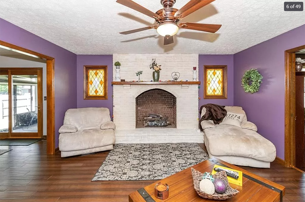
Upon seeing the listing, I thought the purple on the walls in that room looked really bright. I also thought some things looked a bit distorted. I didn’t notice how bad it was until I took another look after Mom’s comments.
Check out the lounge chair and the rocker in the listing photo:

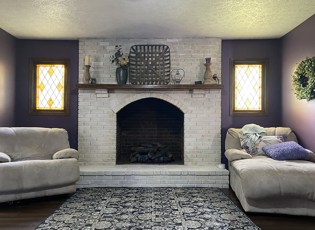
Compare that to what the room really looks like:

There’s not as much of the room visible in my photo, but it’s at least a natural shot without lens distortion and whatever brightening combination and flash were being used.
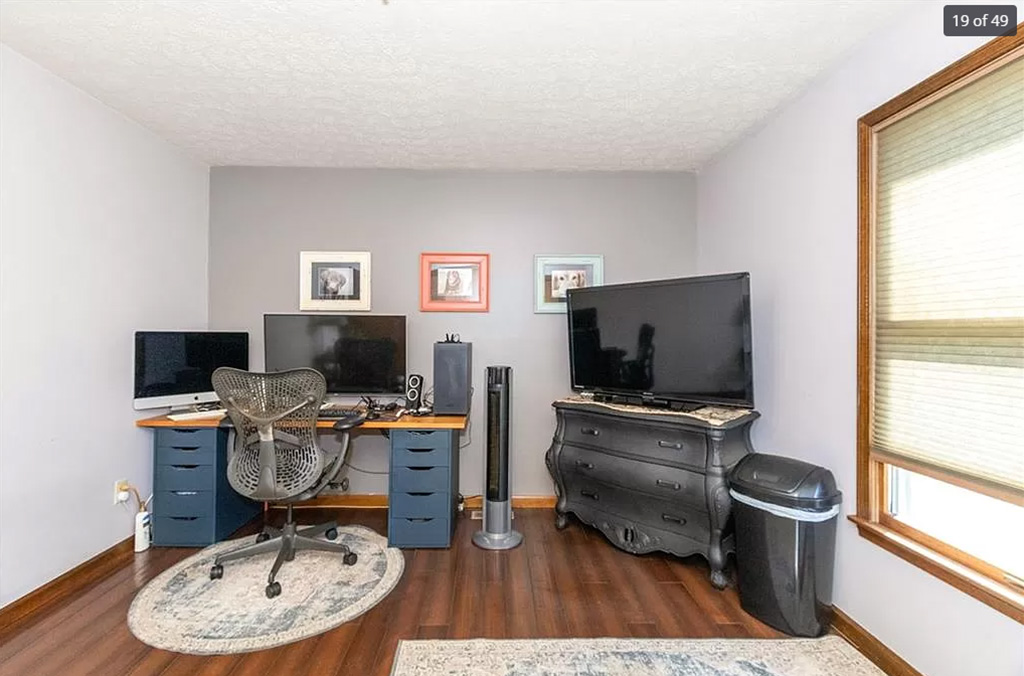
Here’s another example — the listing image of the office…

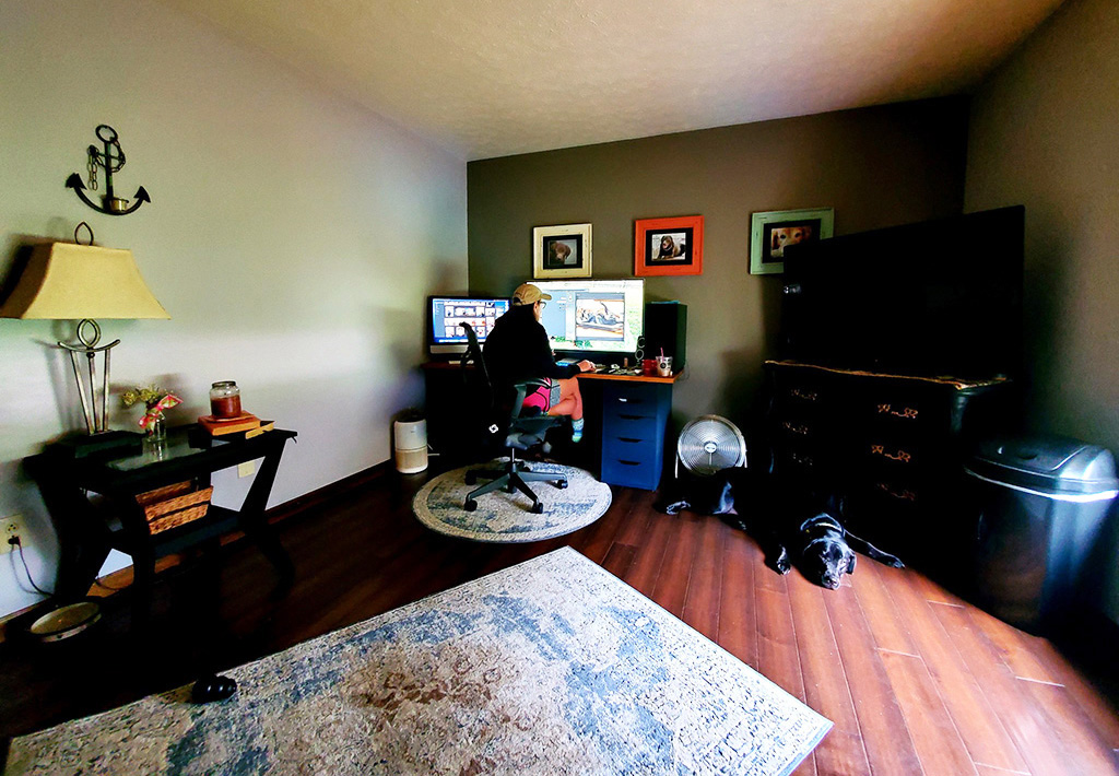
A random shot…

